The Bartlett Exhibition
Introduction
Allow me to paint you a picture; imagine myself, if you can, packing up after working at UCL's open day. Eager to grab as many
giveaways as possible (mind you, I ended up with quite a few), I found myself dashing from department to department across UCL.
As I was leaving the maths department, my eye caught the architecture department across the street. Despite the fact that open
day finished 30 minutes ago, I decided to try my shot at finding some goodies. What I met with, instead, was the Bartlett
Summer Exhibition; 7 floors of absolute brilliance in student design in architecture.
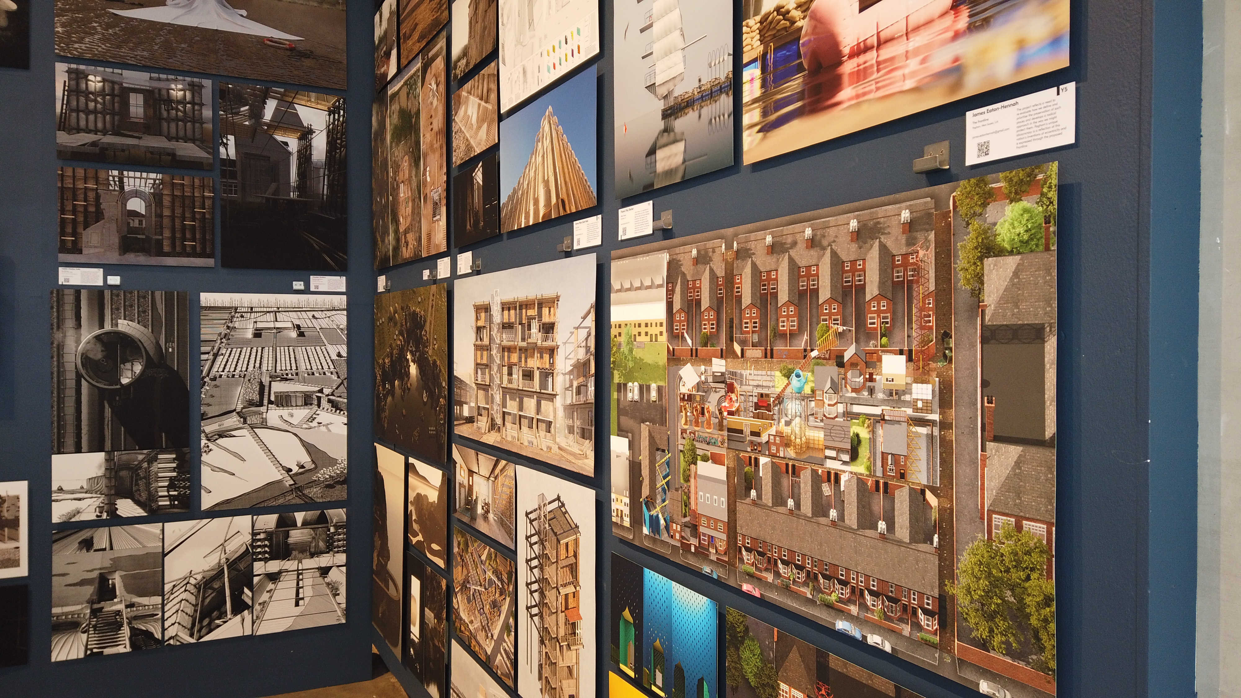
Designs
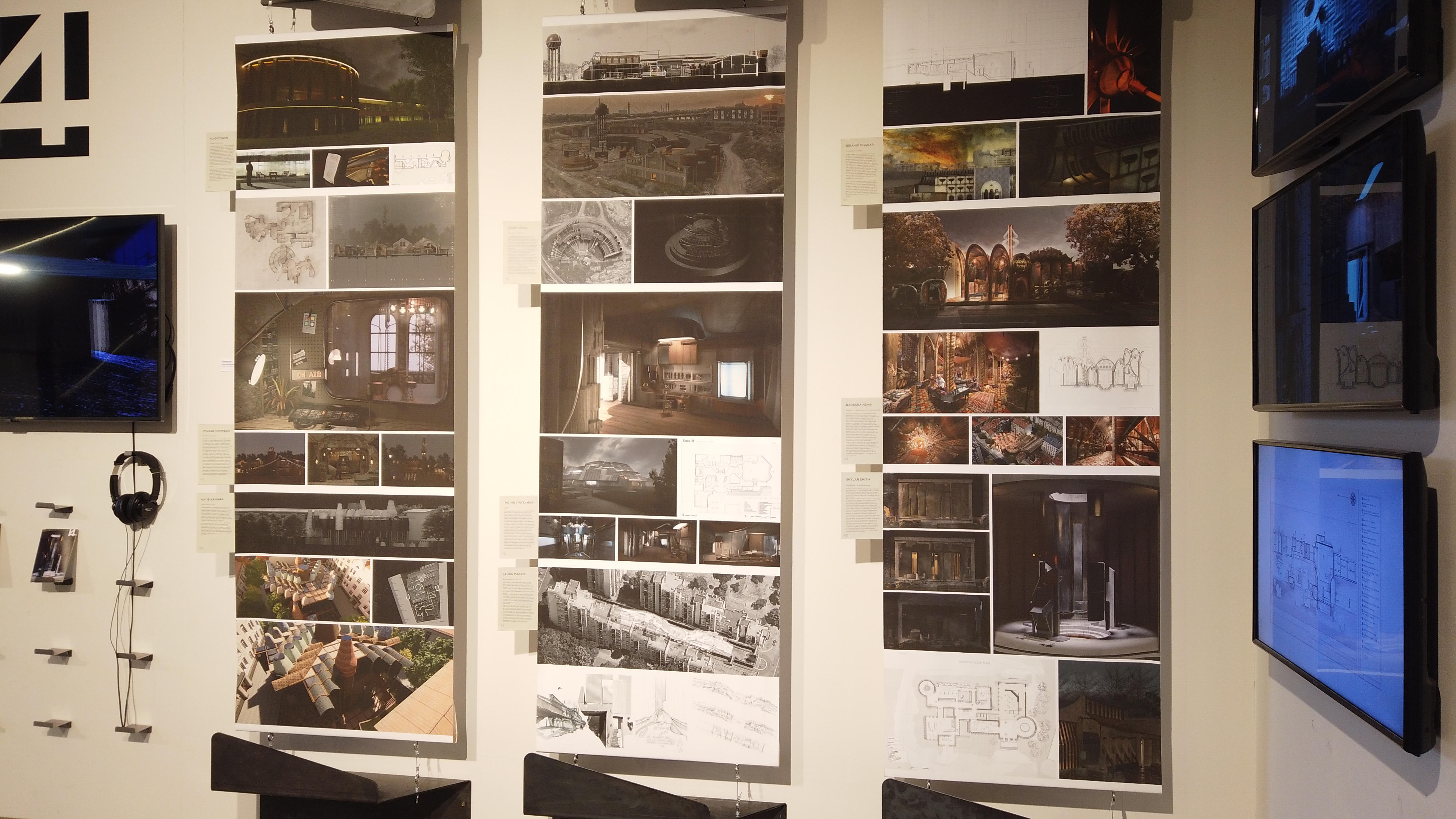
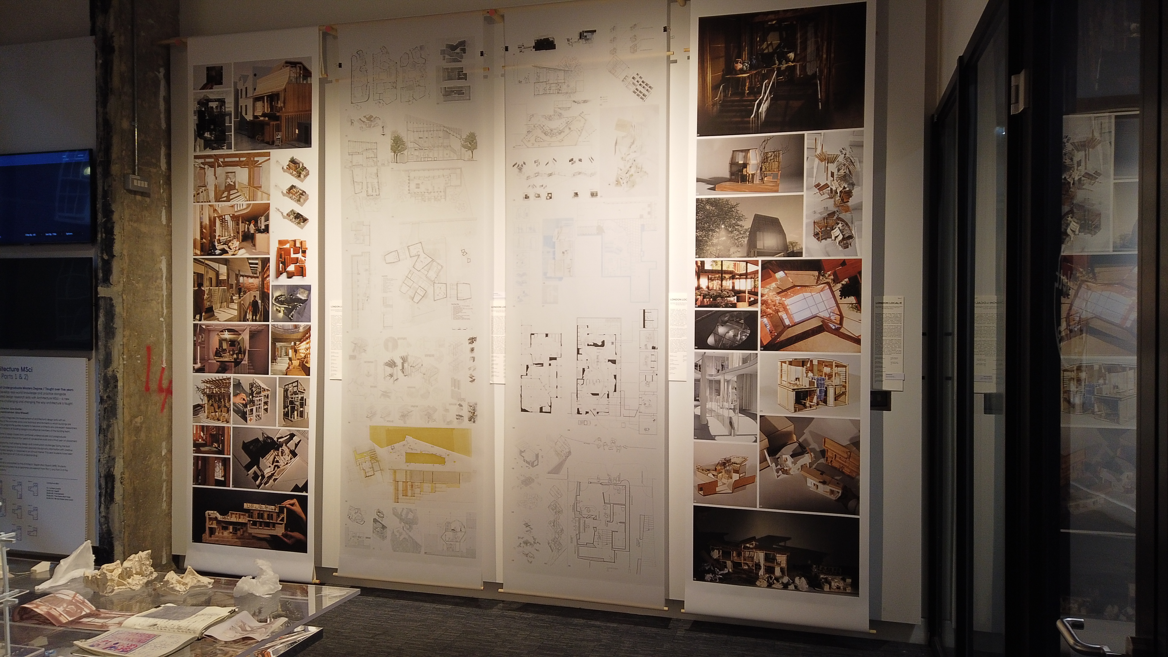
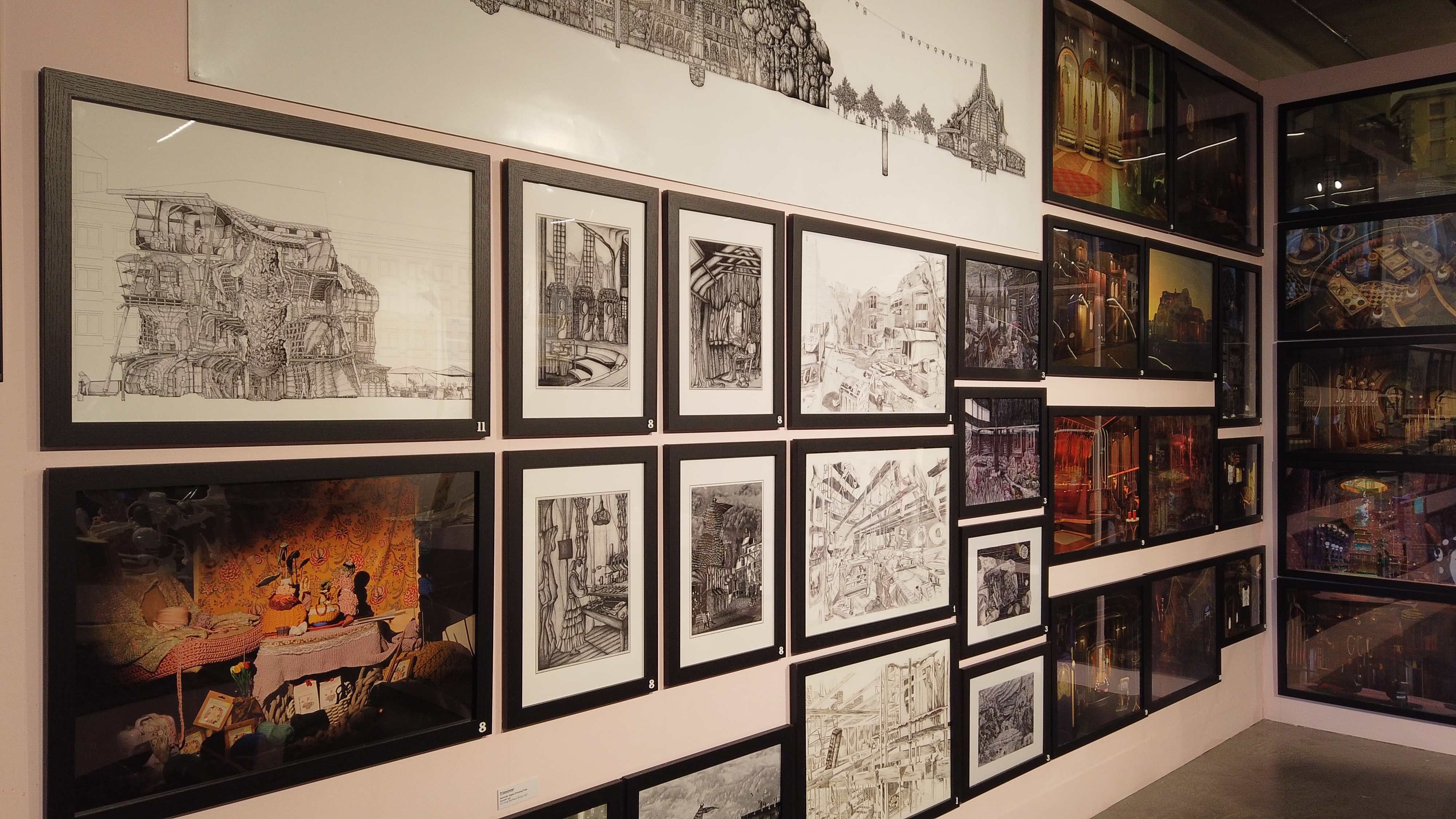
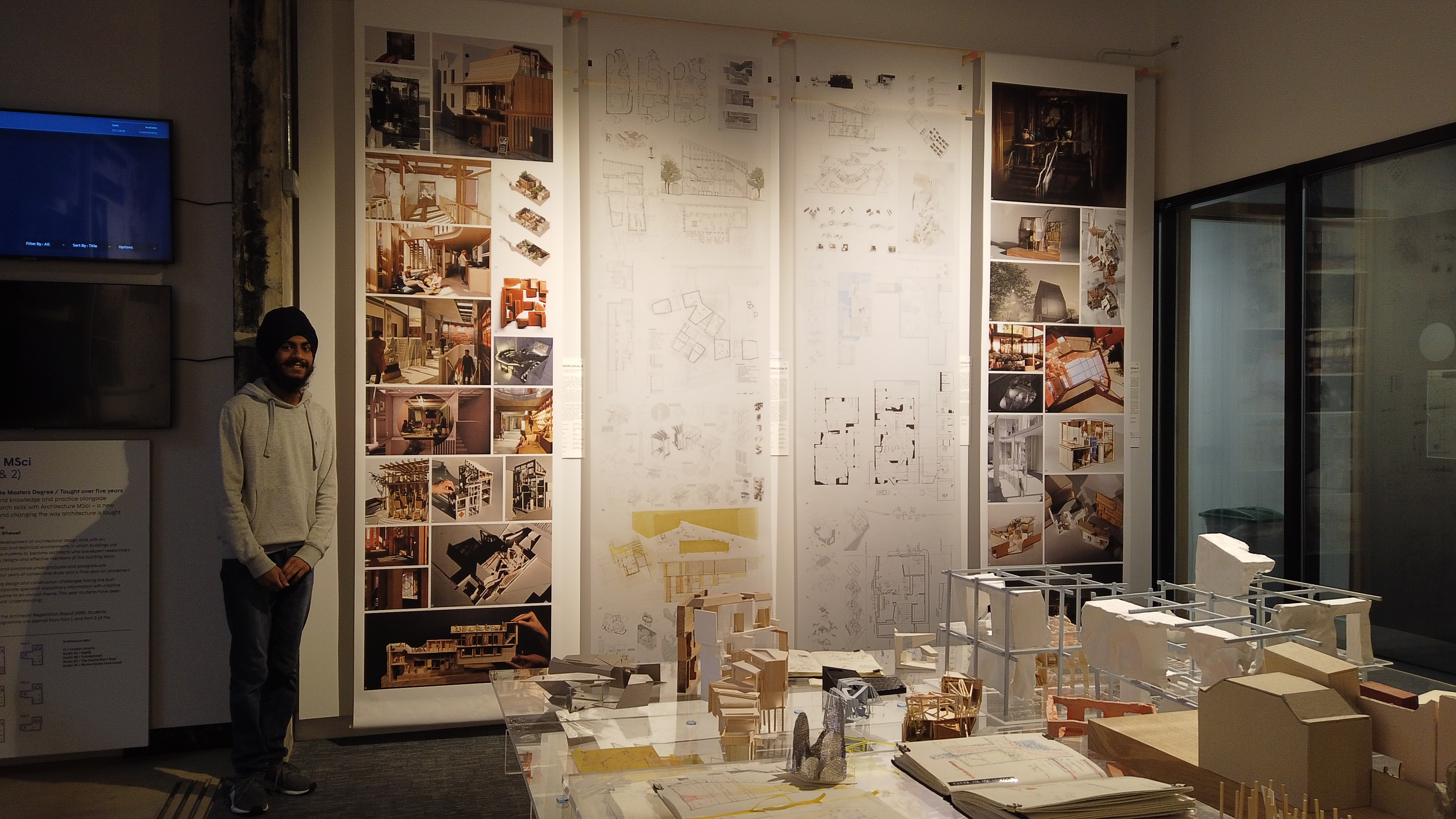
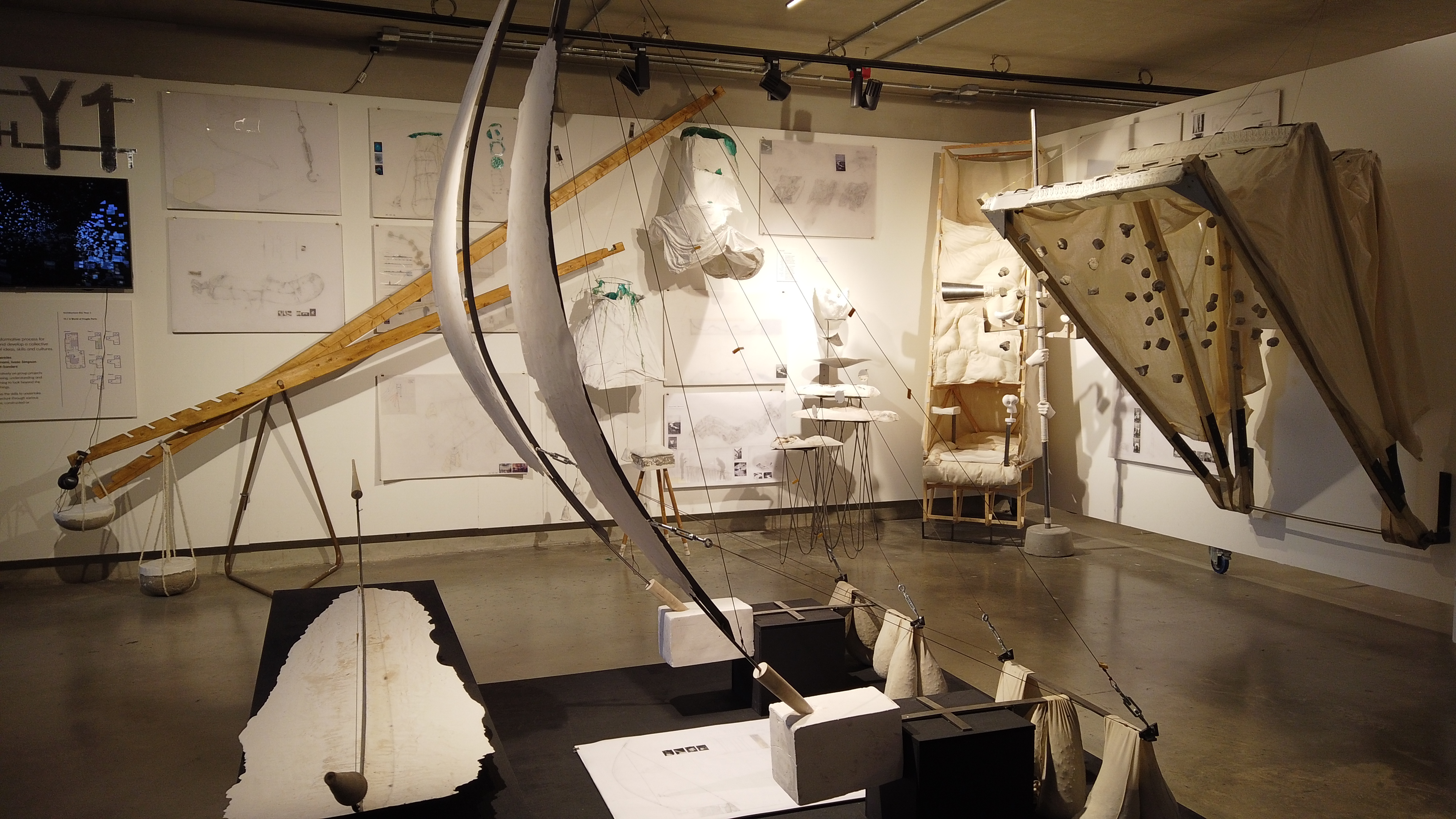
I've been in the architecture building before, as they have a lot of rooms to study in; navigation wasn't hard. It wouldn't
have been otherwise, either, as everywhere I looked was covered in both digital and traditional renders of architectural
landscapes and buildings. There were several screens, all of which came with a set of headphones to immerse you in a video
render of a variety of themed landscapes; almost all of which felt grand, and some of which would not be out of place in a
video game.
What made a lot of the art (mostly from postgrad students) so interesting to me, is that unlike art in general, architects
are confined to feasability in terms of social, environmental and economic factors. This elevates the result to a much higher
standard than a general art-piece. Further to that, these are students as opposed to workers in industry and modern architects;
this makes it even more astonishing when viewing the quality of the work at the exhibition. It's also worth noting that The Bartlett
School of Architecture is the highest ranking Architecture school in the world (QS 2023), and the exhibition really seems to live
up to that name.
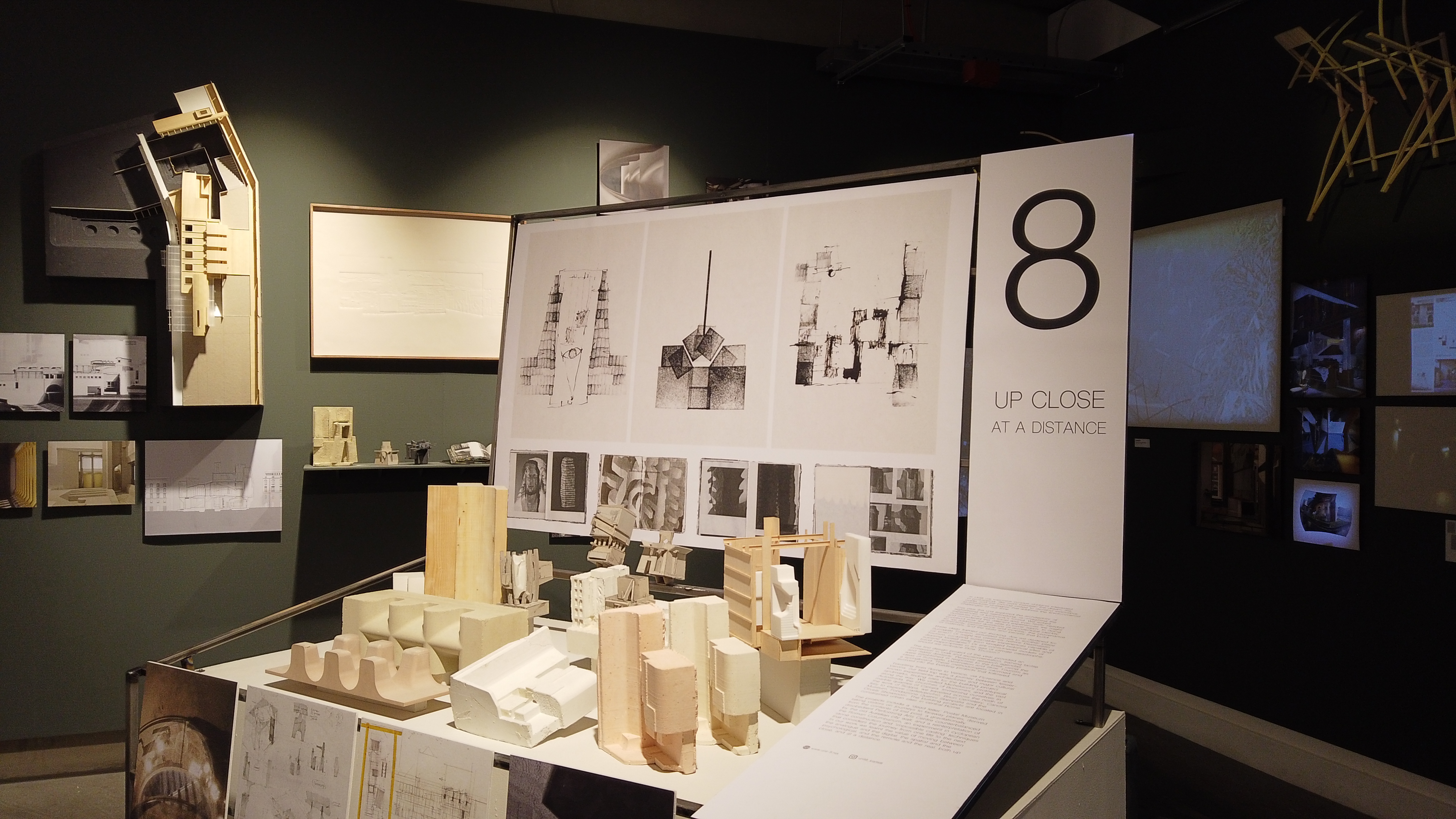
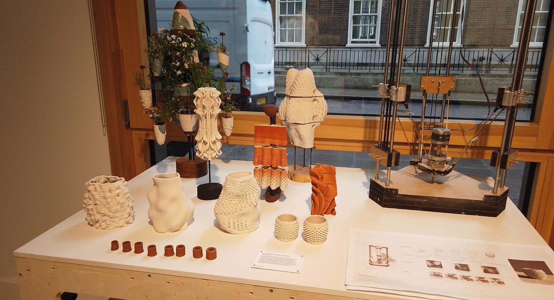
When I later visited, I saw magnificent 3d prints in clay, rather than traditional plastic. Of course, I was not inclined to
touch the exhibits, but from my viewpoint, the various pots and designs appeared good enough to be structurally intact. in general
it reminds me of the solar sinter project made by Markus Kayser, and looks just as good; despite caly being difficult to work with,
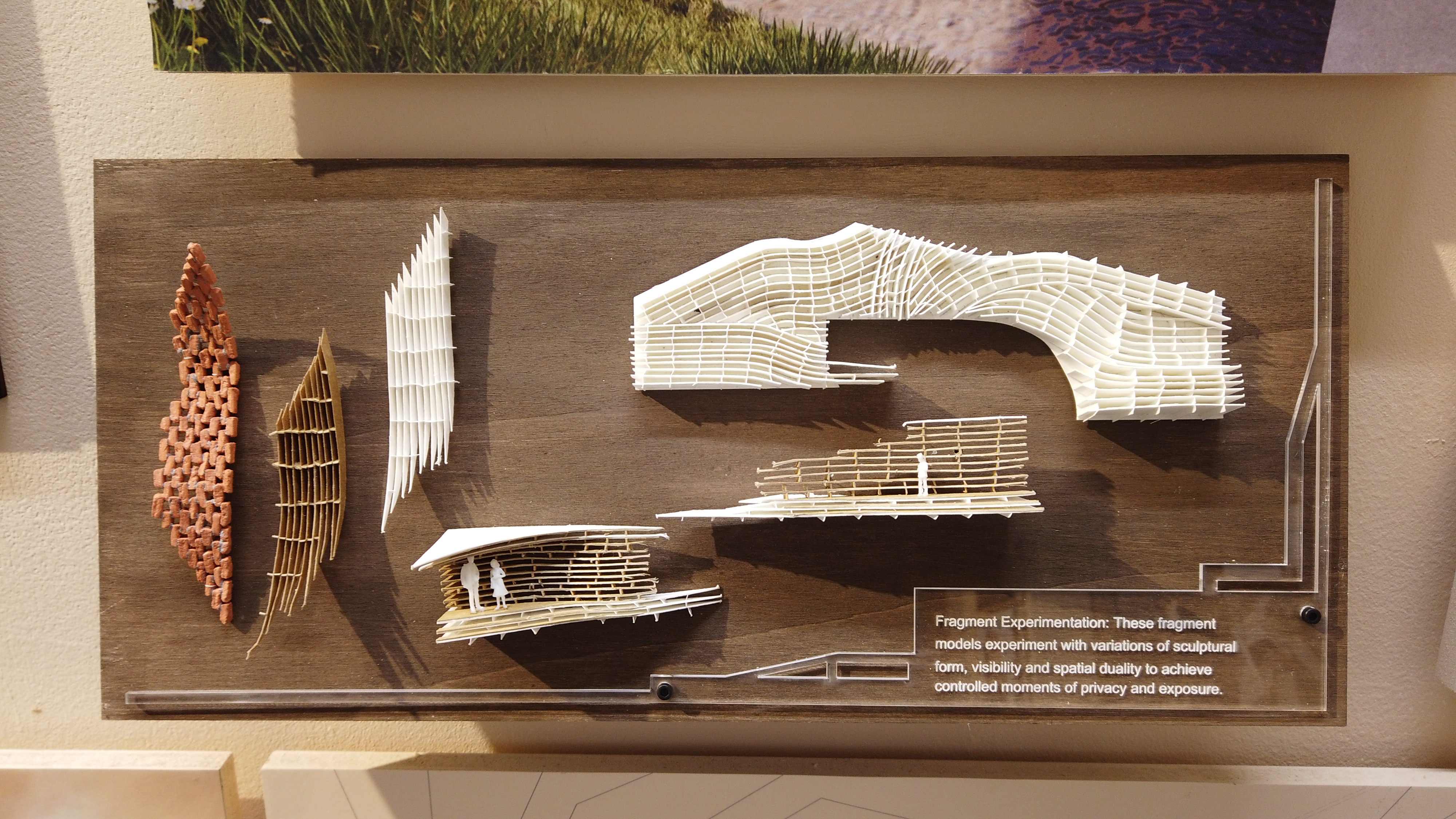
the layers worked extremely well with each other. One of the coolest aspects of the exhibition was the attention to detail in the designs and the ability to scale projects down to small
tolerances. Small minifigures were placed amongst the small scale models of buildings and designs; in general I almost pictured individuals
using tweezers to ensure accuracy in terms of design.
Video
Unfortunately, aside from talking about how interesting and enchanting an experience the exhibition was, there isn't much I can say in lieu of the overall meaning of the art and the specifics of what made it so impressive. However, I decided to return to the exhibition on the 4th of July and shoot a video (and pictures) of the exhibition. Unfortunately, the video did not turn out very good for a mixture of reasons. The first is that I only had one day to film, and I had to film in a specific order (also I'm fairly new to this). Upon arriving, with permission, I filmed various shots of different artwork. The idea then struck me to interview an architecture student. It took about 20-30 minutes of looking, but I was fortunate enough to find Zofia Lipowska and Peter Moore, who were both willing to help out. You can find the video below:
Conclusion
I'm not an architect, nor a student in design and/or architecture. In general, I lack authority in telling people whether something is high or low quality. However, writing from the experience as a visitor, and not an expert, the exhibition was an amazing place to visit, and I hope that this post, in some ways more than others, serves as a way to give back to UCL and their architecture department. You can learn more on their website here.
More Images